Andrew Barrow Photography

Words

Pink Lady Photography Competition

A bit of a flurry this week as I snap a few images for the Pink Lady Photography awards. The competition closes in a couple of days, hence the frantic activity. I’m trying for a couple of different categories this year in addition to the Errazuriz Wine Photographer.

I’ve also just received a stunning wine decanter that I would really like to use in an image but time is pressing so it might not make it to the studio table in time for an entry this year.

I note that the Pink Lady blog featured my entry from last year - it reached the finalist slot but was up against a mass of really strong and impressive images, The writer states

Here, Andrew Barrow has used such props to set a scene for his Wine and Cheese. Using cheese and grapes as well as flowers gives this image a still life feel. We know that the story is about the wine, but it draws us into a feel of how the wine is enjoyed.

‘In the same way that there are artists or there are artists, the same is true of photographers. A photograph can be an art form in its own right. It can deliver mood and pathos, and put across a message in an outrageously powerful manner. In short, it can showcase the very DNA of the brand.’

RPS Fellowship

I received some rather pleasing news yesterday afternoon. My Washing Line series of images, coalesced into a uniform panel, fell under the strict scrutiny of a highly talented and exacting group of RPS accessors. They concluded that the images were worthy of a Fellowship in the RPS, their highest level of distinctions, which was a highly welcome piece of news in these trying times. I am now a fellow of the RPS.

The hanging plan submitted is below. It has been modified somewhat over the weeks before it submission following feedback from the one-to-one advisory session, which if anyone is tempted to apply for an RPS distinction, is a highly recommended course of action.


The hanging plan is shown above. Several of the images haven’t appeared on my social media channels, so I will release them over the coming days.

Woodland Shoot Disaster

My efforts at woodland photography are sadly lacking. Three sessions in and around Watlington Hill, Christmas Common and Aston Rowant woods resulted in a total of zero images worth keeping.

Certainly not up to the likes of Nigel Danson or Steve O’Nions who I greatly admire from their youtube channels. But as Danson says in a recent video it has taken him years of practice, trial and error in reaching his standard. I’ve quite some way to go.

But I had fun. And it got me out of the studio and doing something different.

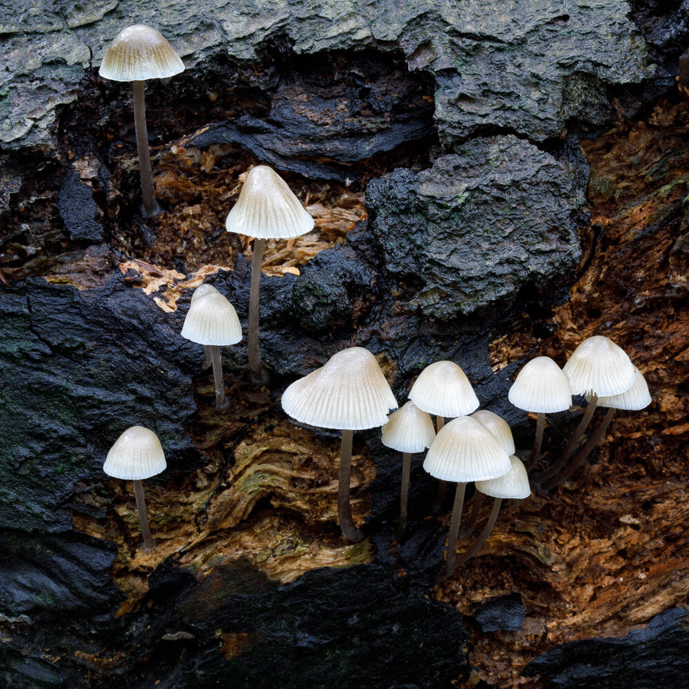
These fungi shots aren’t going to win any awards but I am moderately happy with the results; they are certainly more successful than my woodland efforts.

RPS Panel Advice

I have been working towards a panel for the RPS over the last few months, with the intention of applying for a Fellowship distinction. Like many, I imagine, having ones work subjected to the highest level of photographic scrutiny is daunting. For me, social media comments also raised doubts and a crises of confidence that led me to put off taking the project further for several months.

Today, however, I had a most instructive zoom video meeting with one of the RPS assessors, Paul Mitchell. His critical comments on the panel below were enlightening, instructive and very positive. He reinforced my issues with some of the images, raised ‘concerns’ with some others but overall was entirely positive and supportive of the concept and execution.

One area to address is ensuring that the food used is recognisable. So the fish fingers need to look like day-glow, square fish fingers and the gammon should look like a typical cheap round of gammon and not the artisanal, rare breeds slice I used.

This was the second panel I have presented for appraisal. Last year a visit to RPS HQ in Bristol with a panel made up of wine door images left me feeling a bit lost. I put this down to trying to adapt an existing body of work to the RPS criteria and it just didn’t fit. At least to me.

The washing line project was designed purposely for the RPS. And it works. Well, according to Paul at least.

Overall I left the session feeling inspired, creative and positive. There are 5 images that need replacing (one of which I already have) and interestingly not all the ones I felt were weak. Three images also need looking at again, where either the processing is off or the subject isn’t immediately obvious. The next couple of weeks are going to be busy.


In Use - Kate Backdrops

Since establishing my little studio I have over the years accumulated a multitude of backdrops purchased from a variety of different companies. I have also made my own. Initially, they were limited in size just 4’ square which really limited the options available, experience now teaches me!

Now I’m all for large size backdrops, really intended for portraiture, rather than for still life which is my main studio output.

Unlike many I love playing around in photoshop, dropping in different backdrops or textural overlays, for example, to give a multitude of options to release the final ‘vision’ in the resultant image. Of course, the advantage of physical over digital backgrounds is the ease and immediacy. You hang it and shot; that’s it.

My photo style dictates that I general buy abstract backdrops rather than say, brick wall or room type affairs. One company that I have purchased several abstracts from is Kate Backdrops. They are relatively cheap and offer several abstract type hangings that suited me fine.

When they approached me to offer a couple of backdrops for testing, and for writing about (hence this blog post) I thought I would go for something different. A change in backdrop might keep the creative juices flowing, I thought.

I picked ZJ-J14430-D-1 and ZJ-HJ14916-E-1. The latter is described as a Dark Brown Retro Door, the first as Retro Classical Court Style Warm Colour.

I thought the ‘court style’ with a pedestal of flowers and a great sweep of draped curtains might fit my ‘old master’ style of cocktail images rather nicely. While the Door would add some interesting ‘recognisable’ architectural shapes while keeping the old master style vibe going.

First out the bag was the Door. A quick iron to remove the folds and a hang and I was away. My initial thought was the print had a rather muddy green colour cast to it. Rather than a door, it depicted two wall roundels and a picture frame; at least to me.

The colour cast wasn’t an issue in the final image (The Beauty Beneath Cocktail). Hardly noticeable at all. Once I realised I needed to set the still life up quite close to the backdrop (rather than trying to get the whole frame and roundels in the shot, as you would probably see with a portrait) everything worked out fine. Looking forward to using this backdrop again. Its size should allow its shapes and features to be positioned to give multiple variations.

The Classical Court backdrop I was less impressed with. The print was very undefined (blurry) and was in a different orientation to the Door (being 1.5mx2.2m rather than 2.2mx1.5m) something I didn’t notice on ordering. With this one, I am wondering if I should have selected a 1mx1.5m, so perhaps the image would be crisper and more of those sweeping folds would appear in the image.

The resulting image (Tipperary No.2 Cocktail) makes the backdrop look more abstract than perhaps I was intending, and it’s a bit dark too. So I have included an overexposed test shot, below, to show more of the backdrop in the final setup. More practice and experimentation required with this backdrop I think, to bring out its full potential.

As I mention I have long used Kate Backdrops as a source of affordable backdrops and will continue to use them for future projects (they are far, far easier to iron out any creases than my homemade backdrops made from dyed dust sheets for a start!).

Only two images taken so far, reproduced below, with the still life setup for both at the same distance from the backdrop (about 60cm/2feet). The backdrop images, taken from the Kate Backdrops website are shown for comparison.

Disclosure – Kate Backdrops allowed me to select two from their range and sent them to me for free. No other incentive was offered, and the opinions are my own.

How I Create Images for the Washing Line Project

What began as a light-hearted take on photographing food has turned into an on-going project, something I never contemplated doing.. Images posted to various Facebook Groups and Instagram have garnered many positive comments; to which I am amazed. I certainly didn’t think the images would be so popular. The comments are always positive, picking up on the humour and the whimsicality, which is both encouraging and surprising. One Facebook group I belong to, an RPS closed group, even picked one as their banner image. Which is quite an honour.

I’ve also received questions on how they are constructed.

Each image is a composite, combining the food hung on a washing line (or rather a piece of string) in my little studio. The food is always real and 90% of the time is later eaten, or is just the leftovers of that day’s dinner.

Despite appearances, the most difficult food, so far, was not the fried egg. That, just held in place on the mini frying pan like magic. Macarons was the most frustrating and difficult to shoot. The mess was unreal as the little blighters refused to hold together in the peg. I almost gave up and threw the whole lot in the bin…

They are photographed against an off white wall. In photoshop these are combined with images I have taken of clouds, sometimes one, sometimes two or three overlaying each other. A further l layer is added - one or more textures to give a painterly feel using the Adobe Texture Pro panel. I have accumulated a large library of textures some I’ve taken others from various free internet sources such as CoffeeShop.

(Talking of textures - I am tempted by the Infinite Texture Panel but it is priced outside my comfort zone at nearly £200. Also, the panel doesn’t allow you to add your own textures.)

Further work adds vignetting, colour changes via LUT profiles in Camera Raw, and little details perhaps not noticed (such as a drop shadow on the brick wall in Crisps shown below. Incidentally, the wall is taken from the image of my Three Word Gallery that I had running for a couple of weeks…. (a great idea that didn’t seem to get much traction, sadly, even from the originator).

The full line up of images can be seen in the gallery. Not all have been posted to Facebook or Instagram.

Washing Line Project - Crisps

Three Word Galleries

I can’t claim any credit for inventing this marvellous idea; that’s down to the highly talented photographer and fellow MA graduate Megan…


The concept is simple, using a small collection of images, you create a mini public gallery. The name of your gallery, the space you choose, is determined by the location as provided by the whatthreewords app. This app overlays the world in a grid and assigns three words to that space for a unique identifier.


I selected the wall at the back of my parking space - Broadens.Rang.Melts Anywhere would do that is accessible by the public. I’ve used a converted red phone box in the past as an exhibition space, that would be perfect for example. Megan, I understand, is using the large gates at the entrance to her house.


The social media tag to use is #whatthreewordsgalleries On Instagram the page to follow is @whatthreewordsgalleries.


What images to display? Anything! Megan sent me over some sheets of paper for creating some cyanotypes, which I was going to use. I thought it might be fun to create some from images taken from the Broadens.Rang.Melts square, print out a negative on acetate and use that to create the cyanotypes. But the results are not consistent and now my printer refuses to accept the acetate sheets to produce more; even though it happily printed off five yesterday morning.


So plan B is a display selected from the washing line project images. It is now up and viewable… not sure how they will fair in the rain mind, but easily replaced…


As the virus restrictions are slowly being lifted now is the time to put some art on display for free. I do hope people will join in as I think it is a grand idea.

broadens.ring.melts

Washingline Project

The Washingline Project Gallery has just been updated with three more images. I’m rather amazed at the positive reactions to these; “innovative and unusual” was one comment. Such comments spur one on to continue. The actual aim is to put these forward as a distinctions panel for the RPS; although this means I am only halfway through producing the required number of images with a few spares.

I rather enjoy the whimsey in producing these - the butterfly on the pastry, the lighter than light macarons requiring the line to be propped up by a stick, and the pappardelle pasta blowing in the wind. Both the stick and a butterfly will be used in future images I think.

But it’s not just an alternative way to display and photograph food. The Fish Fingers and Chip is a take on the isolation we are currently enduring for example. (Although, if I am honest, this is the only one with an intentional ‘message’, whatever people read into the others).

The three latest additions are Prawn Toasts, Pork and Lemon Pelpettine with Pappardelle Pasta and Macarons.

Errazuriz Wine Photographer of the Year - Produce

Delighted to have been placed third in my category last night at the Pink Lady awards, specifically in the Errazuriz Wine Photographer of the Year - Produce section. The virus meant the usual event in London, which I love attending each year, didn’t go ahead and, sadly, the live sessions on Facebook and elsewhere seemed to suffer technical issues. But I was there in spirit.

The full gallery of winners is available to view on via https://www.pinkladyfoodphotographeroftheyear.com/finalists-gallery-2020/

Errazuriz Wine Photographer of the Year - Produce 3rd Place

Pink Lady Food Photography Entry Success

Delighted that one of my submissions to the Pink lAdy Photography Competition has been shortlisted. The Wine and Cheese image below is listed in the Errazuriz Wine Photographer of the Year - Produce category. The winning images will be announced at the virtual awards ceremony on Tuesday 28 April.

Funny really that this image was entered just to fill the available spaces per entry; I personally don’t think it was the strongest image submitted but still delighted to have made the finalists.

Cheese and Wine Old Masters Style

Cheese and Wine Old Masters Style

False Tables or How I create tables for Still Life Photographs

Not sure the room really warrants the grandiose title of ‘studio’. It’s small, barely enough room to walk around once the computer and desk plus prop shelving unit, small shooting table and back drop stand are in place. In reality it’s a second bedroom with a tiny window.

Concentrating on cocktail and wine still life images means I have a large collection of glassware, cocktail shakers and so on. Which doesn’t leave much room for different tables which I find are much required to keep the creativity alive.

Looking at the cocktail.collection Instagram feed might give the impression of many different tables but it is simply a collection of various wooden tops paired with false legs and draw fronts. Some tops are literally just two planks of wood nailed together. Even the draws for these tables are false with glued on handles.

Why the need for such a setup? Why not just use the plethora of backdrops designed for food photographers?

Well my style at the moment draws from the 16th/17th century old master style of art. These are practically all setup on tables. The opportunity of having different setups available, without resorting to the cost of buying and storing different tables, aids my creativity no end.

The central table the sets are built on is just 34” square.

The photos below show one such table setup with the resulting photograph showing the final result.

Homemade Backdrops

Anyone who has had any exposure to still life photography or studio work will know just how expensive backdrops can be. I have a couple from Kate Backdrops company, one of which I use very often.

I’ve been hankering after a few more. I find the addition of new props and new backgrounds often sparks a flurry of creativity. At least the desire to use the new additions immediately spikes a renewed endeavour and lifts one out of any photographic slump. With half an eye on wanting some new lenses (I’d like an 85mm and a tele zoom ideally) money saving is uttermost in my mind. With a new commission from a gin producer just landed my creativity needed a boost. A new backdrop, in a colour I don’t own, was required. I had a blinding thought – I’ll make my own!

Examples and instructions abound on YouTube. These usually revolve around painting, using sponges and so forth. However, the idea that some, ultra cheap, dust sheets and some fabric dye could work and be easier to create than needing space for the, invariably, messy paint job.

A set of three cotton dustsheets were duly sourced from Amazon (£25.99) and four packs of dye at £3.73 each. Total cost £41.42. Oh and two 25p tubes of salt from Waitrose. Colours ordered were Ocean Blue (for the Gin Commission), Plum Red, Espresso Brown and Sandy Beige.

I didn’t want to use dyes for washing machines as the colour would be uniform. I was after something a little more creatively patchy. Each dust sheet was cut in two, damped and then scrunched up before placing in a tub with the dye. I experimented first with the Sandy Beige, but this didn’t produce anything I thought I could use – too light. So this was re-dipped in the Expresso Brown. More experimentation - keeping the inner portion of the sheet above the main body of dye for example to produce a vignette. Plum Red and Espresso Brown combined produced exactly what I was after. As did the blue mixed with the red.

The soaking in the dye takes just 45 minutes. The natural drying rather longer. Over a weekend I produced six different backdrops for just £6.90 each. Total bargain. Was I pleased with the results? You betcha! They do need a bit of ironing mind.

Florence Exhibition Ends

A lovely note from the organisers of the Wine Doors Exhibition in Florence, that ended last weekend.


the other day I dismantled the photographic exhibition at the Pergola.

Since last November 9, the day of the inauguration, thousands of people have passed during the shows and guided visits to the theater, and many have stopped to look at the beautiful photographs of Andrew and Robbin.

The people at the bar counter told me that the comments were very positive, many people complimented them, many signed and left a sentence on the guest book. Here is what I found on the last page:


"Niches, flashes of light, colours of time, sensations ... Sometimes the detail eludes us, sometimes the essential, fortunately there are those who manage to capture emotions."

These are words addressed to the two photographers, whom I thank for their availability and skill.

This initiative has certainly made known the wine holes to many people, showing them in a particular light: for the association, a good result.

Greetings to everyone

Libertalia Exhibition, Blackpool

Mightily delighted that my Seascape Triptych was selected for inclusion in the Libertalia Exhibition about to open in the Hive Gallery, Blackpool.

The three images, taken in Blackpool during a brief respite from a nasty storm, form part of the Impressions of Place series that I am currently working on and experimenting with.

Libertalia has a private view on Friday 13th December 2019 (5-7pm) with the exhibition running from the 15th January until the 15th February 2020. (Closed for Christmas and New Year). Opening times are 11-5pm Thursday to Saturday.

Seascape Triptych © Andrew Barrow 2019

79104692_504923270132467_2155233976615174144_n.jpg

Preparations for the Libertalia Exhbition, Hive Gallery, Blackpool


"The exhibition tells the hidden story of our pirate ancestors who guarded people’s liberties. They are said to have founded ‘Libertalia’ 300 years ago with pirate gold, to create a place where people could be equal and masters of their own destiny. Some believe Ingela Gathenhielm was its mastermind. Known as the pirate queen, she led a global pirate empire from her Pirate House in Gothenburg.

The exhibition transports her pirate house to Blackpool, filling it with images, sounds and symbols that resonate with Ingela and what she stood for. It invites the Gathenhielm pirates back to help us imagine what Blackpool would look if it were ‘Libertalia’ today, asking audiences to contribute to a ‘Libertalia’ manifesto for Blackpool and raise the ‘Libertalia’ flag.

Conceived by UK & Swedish artist-pirate’s Alexis K Johnson and Isabel Lagos, the exhibition is co-curated by Arrested Re-Development’s Dawn Mander, Libby Nightingale and Kate Yates. Featuring the work of artists from Gothenburg, Blackpool, Liverpool and South America including John Mark Allen, Jorge Alcaide, Andrew Barrow, Dylan Cross, Jacquie Cross, Norma Foulds, Piet Geboers, Mark Hetherington, Simon Job, George Johnson, Mathew Jones, Beata Kuczynska, Teto Lagos, Lisa McQueenie, Olivia Du Monceau, Jess Monger, Gareth Monger, Andrea Norrington, Richard Oughton, Juan Carlos Poblete, Anna Radovich, Monica Ravliuc, Jackie Sarafopolis, Peter Jamieson Sinclair, Ruta Staseviciute, Douglas Stewart, Kieran Thresh, Tracey Vallance, Danielle Waine and Elizabeth Ward. With performances by Sean Brown, Laura Colville, Baz Garrod, Linda Hampton, Tom Wright, and local residents.

Follow ‘Libertalia’ on Facebook and Twitter @TheLibertalia"


Wine Doors of Florence Exhibition

No time during the busy opening event to take any photos - thanks though to all that came, and to those that ordered prints. For those that couldnt attend (the exhibition runs until January 2020) below a selection of the hall before the arrival of everyone. The exhibition is at the Caffè Guido Guidi at the Teatro della Pergola, Florence.