Andrew Barrow Photography

Words

Posts in In the Studio
Ice-Cream on a Vintage Kitchen Scale

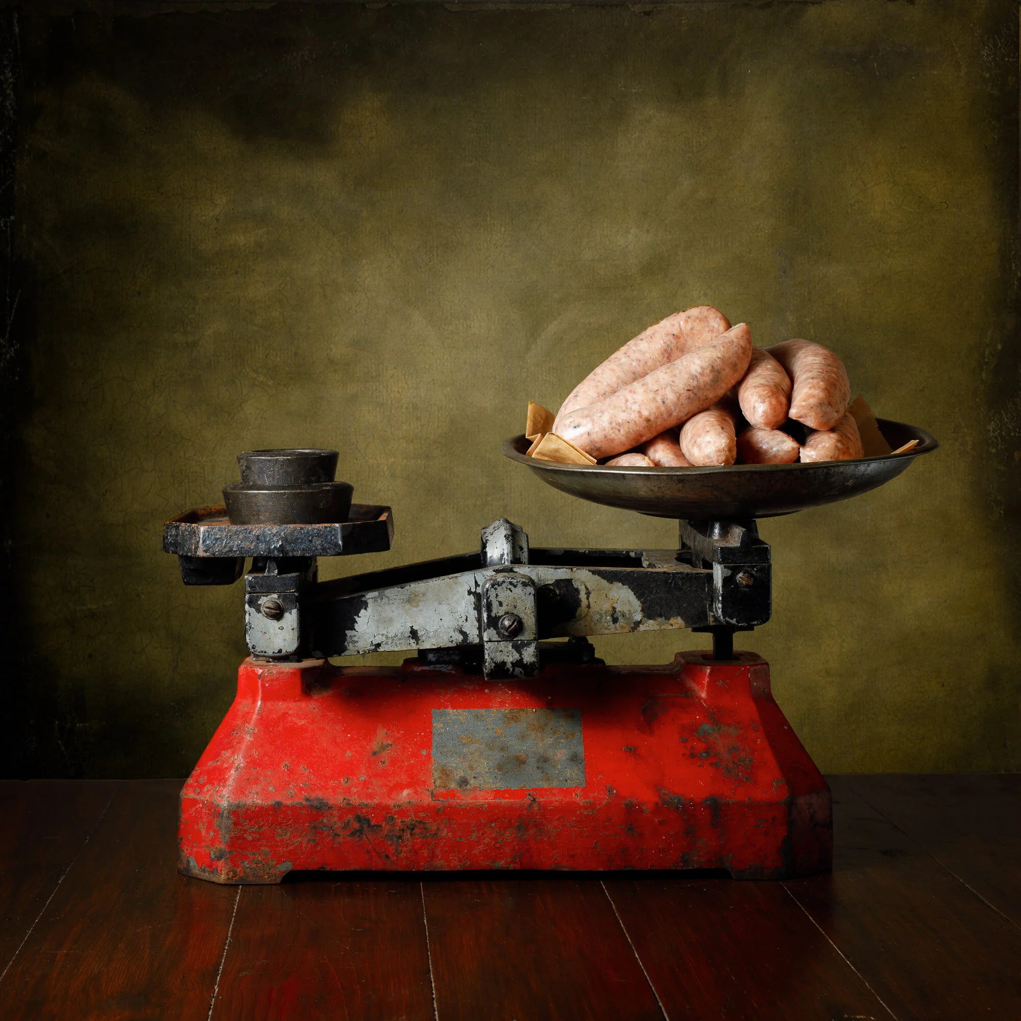
As with the Washing Line Series, some of the Kitchen Scales images work better than others. Raw Sausages might be great as an advertisement in a butchers but not so desirable on a kitchen calendar perhaps. One comment I have received is that, while technically good, the Scales series does not demonstrate the same level of quirkiness as seen in my other still life work.

As with all sets of photographs they develop and mature with each addition and adapt to criticism and feedback. Some work, others don’t. I’m hoping this ice-cream image brings back a little of the quirkiness; it’s the latest addition to the series.

It took a few attempts to get it right. Initially, I was after an ice-cream cone that you get from the vans at the seaside. A highly whipped soft ice cream which, obviously, has to have a flake in it. I don’t live near the sea and I haven’t seen a van in town like, ever. So an attempt was made using whipped double cream piped into place as an attempt to replicate the soft waves seen in the originals.

I wasn’t sure it worked. A talented photography friend agreed and put their finger right on it; the cream doesn’t look wet enough. Looking at it today it just resembles shaving foam rather than ice cream! I resorted to ‘normal’ ice cream, the actual stuff, a soft scoop from the local supermarket. ‘Wetness’ was there, important as it needed to look slightly melted, for drips.

The next issue my friend pointed out in the second image was the size/scale of the flake. It’s huge and looks like it is just there propping up the cone. In a real ‘99’ the flake is half-sized. At this point, the cone and its contents had been consumed and the set-up cleaned. Really liked the arrangement of the ice cream and its drip though and lacking time to restyle the whole still life I resorted to a little play in photoshop.

Another flake was chopped in half and photographed on the scales at pretty much the same angle as the original. Photoshop was then used to mask out the old one. I don’t think you can tell.

Some good comments received over this image. It is available as a print on Etsy.

Now I just have to ensure the level of ‘quirkiness’ is maintained.


Twigs in a Vase

I brief walk yesterday in the rain and strong winds. I had to get out of the flat for some fresh air and away from the computer screen.

In addition to finding some wild garlic - which I did'’t get to use in a photo before eating - a gnarly, twisted twig fell into my path which I knew would make for a good subject. It seems I am building up a little series of flower/foliage images… I rather like the simplicity and delicacy of this image. I’ve gone for a 4x5 crop rather than my usual square format as I felt the extra space was around the subject was required.

Gerbera Still Life

One of my own ‘criticisms’ is that my images verge on the dark, moody end of the scale. It’s just me I guess… an inherent style, that my eye just prefers. I marvel at those who produce images that are light and airy. Just scrolling through my Instagram feed highlights plenty of fantastic photographers and image-makers that seem to manage this lighter, softer style with little effort.

Having just purchased a Gerbera for a little gift to my sister when I visit later this week, I thought I would at least try and get an image in a lighter style. This is the result…

Gerbera-1.jpg
I WILL Use that Set of Red Scales

From the kitchen ‘man draw’, I retrieved a screwdriver and simply removed the cradle from the red kitchen scales. For those who know me personally having me actually owning a screwdriver might come as a surprise… but there it was. Still in its original packaging…

The oversized red scales look lovely but the cradle and tray is large enough to hold a small child and proved impossible to use in the Kitchen Scales series of food pictures. Removing part of it means it doesn’t work as a scale anymore but I don’t think that matters in terms of being a photo prop.

For the first image, I went with Sausages from my local butcher. They are simple herby sausages, they call them Farmhouse Sausages, and are a firm favourite. I just used a tray from one of the other scales and am rather pleased with the result.

Having uploaded the image to Instagram and put the print up for sale on Etsy, if the background is a bit ‘muddy’ and I should have gone for a cleaner green texture…

Sausages on Red Kitchen Scales.

The Kitchen Scales series is progressing well. The intention is to construct two calendars - one focusing on fruit and vegetables, a meat-free version if you like, while the other has a mix of fresh produce and meat/fish and so on.

Hot Cross Buns on Vintage Kitchen Scales

I was reading a little inspirational book the other day, one targeted at photographers and artists. One passage jumped out at me “There’s an intuition that you only gain through the repetition of practice”. It struck home as I struggled to use that large red kitchen scales in an image.

It just was not working. I couldn’t get the angle right, the tray positioned so the 16 (!) hot crossed buns inside displayed as I wanted. Intuition told me it just was not going to work.

I had to prop the tray up at the back so the rull array of buns was fully visible. But in doing that the tray became detached from the scales supports. To hide this I slide the camera along seeing that the little and would fix the issue in photoshop. But no, intuition kicked in and I abandoned the idea.

Actually I abandoned the scales rather than the idea by replacing them with a different set. A few test shots later - trying to get balance with buns outside the weighing tray - and I was happy. The final image is now up on Etsy. Hot Cross Buns on Vintage Kitchen Scales by AndrewBarrowPhotos https://etsy.me/2Qto8iv

More Scales!

Yesterday I described my EBay spree on acquiring several different vintage scales. I had five on the shelves and, in fact, had already used each in a photo. This number would give me plenty of options for the series of images I had planned. I even checked EBay to ensure I had no further bids that would result in more such scales arriving.

Then two more were delivered.

I had no idea I had been so extravagant (aka reckless). Am I really the only person with an interest in these things that no one else bid on them?

The first to be delivered was a nice little creamy yellow number. Not certain the dish is original but it matters not. (The Comet Scales I used for the doughnut shot is obviously missing its plastic tray. But this doesn’t matter as it would obscure the contents inside I think).

Latest New Scales - perfect size, lovely cream colour.

It is the second new set of scales I am having problems with. I seem to have underestimated its size. The tray is more like a coal-scuttle! I imagine it was used for scooping large quantities of flour or seeds or something. But it is huge. I have no idea how I am going to be able to utilise it in a photo!

I could drill a hole in the back of the tray and use it as a plant holder. But this rather defeats the point of buying it…

The photos below are all unprocessed. I’ve included one of my little studio for those who enjoy seeing ‘behind the scenes’. One moan, however - the sender of the red scales used a huge amount of packing tape and stuck it directly to the scales. On peeling, even gently, the tape removed the gorgeous red paint.

Kitchenalia

Enjoyed a little eBay indulgence last week. Seemed to have ended up with five different kitchen scales. All are old and battered as I was after a certain vintage kitchenalia vibe. If I am honest I only wanted one or two of these sales; NO IDEA how I ended up with five… I’ve just checked eBay to ensure I haven’t bid on any more!

Now they are all here I have enjoyed a few hours of using them combined with various food items. Some didn’t work - spinach for example looked like wilted weeds pulled from a central reservation. But the ones below I am happy with.

Production is similar to my other studio work, but I’m using a flash rather than natural light. Small flash and a huge softbox. The ability to move the light so it wraps around the subject is vital here when compared with the natural light of, say, the Washing Line images.

One thing I did learn from submitting the Washing Line images to the RPS for the Fellowship is that the subject must be instantly recognisable. Spinach didn’t. Doughnuts, flour, lemons and the rest do.

I have also dipped my toe into the world of Etsy selling and have added these to my new store. Would be lovely if someone made a purchase! Food Related Fine Art Photography Prints by AndrewBarrowPhotos (etsy.com)

Cake Still Life

What does a photographer do to say thanks when given cake? Take a photo and hand over a print!

In this case it was two cakes within a week. One family, two cakes. First was a delicious marbled Walnut Cake, followed, a few days later by a light but moist and perfectly Iced Lemon cake. I hope both the young bakers enjoy the prints as much I enjoyed the cake! Thank you to both.

Walnut Cake

Iced Lemon Cake

In Use - Kate Backdrops

Since establishing my little studio I have over the years accumulated a multitude of backdrops purchased from a variety of different companies. I have also made my own. Initially, they were limited in size just 4’ square which really limited the options available, experience now teaches me!

Now I’m all for large size backdrops, really intended for portraiture, rather than for still life which is my main studio output.

Unlike many I love playing around in photoshop, dropping in different backdrops or textural overlays, for example, to give a multitude of options to release the final ‘vision’ in the resultant image. Of course, the advantage of physical over digital backgrounds is the ease and immediacy. You hang it and shot; that’s it.

My photo style dictates that I general buy abstract backdrops rather than say, brick wall or room type affairs. One company that I have purchased several abstracts from is Kate Backdrops. They are relatively cheap and offer several abstract type hangings that suited me fine.

When they approached me to offer a couple of backdrops for testing, and for writing about (hence this blog post) I thought I would go for something different. A change in backdrop might keep the creative juices flowing, I thought.

I picked ZJ-J14430-D-1 and ZJ-HJ14916-E-1. The latter is described as a Dark Brown Retro Door, the first as Retro Classical Court Style Warm Colour.

I thought the ‘court style’ with a pedestal of flowers and a great sweep of draped curtains might fit my ‘old master’ style of cocktail images rather nicely. While the Door would add some interesting ‘recognisable’ architectural shapes while keeping the old master style vibe going.

First out the bag was the Door. A quick iron to remove the folds and a hang and I was away. My initial thought was the print had a rather muddy green colour cast to it. Rather than a door, it depicted two wall roundels and a picture frame; at least to me.

The colour cast wasn’t an issue in the final image (The Beauty Beneath Cocktail). Hardly noticeable at all. Once I realised I needed to set the still life up quite close to the backdrop (rather than trying to get the whole frame and roundels in the shot, as you would probably see with a portrait) everything worked out fine. Looking forward to using this backdrop again. Its size should allow its shapes and features to be positioned to give multiple variations.

The Classical Court backdrop I was less impressed with. The print was very undefined (blurry) and was in a different orientation to the Door (being 1.5mx2.2m rather than 2.2mx1.5m) something I didn’t notice on ordering. With this one, I am wondering if I should have selected a 1mx1.5m, so perhaps the image would be crisper and more of those sweeping folds would appear in the image.

The resulting image (Tipperary No.2 Cocktail) makes the backdrop look more abstract than perhaps I was intending, and it’s a bit dark too. So I have included an overexposed test shot, below, to show more of the backdrop in the final setup. More practice and experimentation required with this backdrop I think, to bring out its full potential.

As I mention I have long used Kate Backdrops as a source of affordable backdrops and will continue to use them for future projects (they are far, far easier to iron out any creases than my homemade backdrops made from dyed dust sheets for a start!).

Only two images taken so far, reproduced below, with the still life setup for both at the same distance from the backdrop (about 60cm/2feet). The backdrop images, taken from the Kate Backdrops website are shown for comparison.

Disclosure – Kate Backdrops allowed me to select two from their range and sent them to me for free. No other incentive was offered, and the opinions are my own.


Washingline Project

The Washingline Project Gallery has just been updated with three more images. I’m rather amazed at the positive reactions to these; “innovative and unusual” was one comment. Such comments spur one on to continue. The actual aim is to put these forward as a distinctions panel for the RPS; although this means I am only halfway through producing the required number of images with a few spares.

I rather enjoy the whimsey in producing these - the butterfly on the pastry, the lighter than light macarons requiring the line to be propped up by a stick, and the pappardelle pasta blowing in the wind. Both the stick and a butterfly will be used in future images I think.

But it’s not just an alternative way to display and photograph food. The Fish Fingers and Chip is a take on the isolation we are currently enduring for example. (Although, if I am honest, this is the only one with an intentional ‘message’, whatever people read into the others).

The three latest additions are Prawn Toasts, Pork and Lemon Pelpettine with Pappardelle Pasta and Macarons.

False Tables or How I create tables for Still Life Photographs

Not sure the room really warrants the grandiose title of ‘studio’. It’s small, barely enough room to walk around once the computer and desk plus prop shelving unit, small shooting table and back drop stand are in place. In reality it’s a second bedroom with a tiny window.

Concentrating on cocktail and wine still life images means I have a large collection of glassware, cocktail shakers and so on. Which doesn’t leave much room for different tables which I find are much required to keep the creativity alive.

Looking at the cocktail.collection Instagram feed might give the impression of many different tables but it is simply a collection of various wooden tops paired with false legs and draw fronts. Some tops are literally just two planks of wood nailed together. Even the draws for these tables are false with glued on handles.

Why the need for such a setup? Why not just use the plethora of backdrops designed for food photographers?

Well my style at the moment draws from the 16th/17th century old master style of art. These are practically all setup on tables. The opportunity of having different setups available, without resorting to the cost of buying and storing different tables, aids my creativity no end.

The central table the sets are built on is just 34” square.

The photos below show one such table setup with the resulting photograph showing the final result.

Homemade Backdrops

Anyone who has had any exposure to still life photography or studio work will know just how expensive backdrops can be. I have a couple from Kate Backdrops company, one of which I use very often.

I’ve been hankering after a few more. I find the addition of new props and new backgrounds often sparks a flurry of creativity. At least the desire to use the new additions immediately spikes a renewed endeavour and lifts one out of any photographic slump. With half an eye on wanting some new lenses (I’d like an 85mm and a tele zoom ideally) money saving is uttermost in my mind. With a new commission from a gin producer just landed my creativity needed a boost. A new backdrop, in a colour I don’t own, was required. I had a blinding thought – I’ll make my own!

Examples and instructions abound on YouTube. These usually revolve around painting, using sponges and so forth. However, the idea that some, ultra cheap, dust sheets and some fabric dye could work and be easier to create than needing space for the, invariably, messy paint job.

A set of three cotton dustsheets were duly sourced from Amazon (£25.99) and four packs of dye at £3.73 each. Total cost £41.42. Oh and two 25p tubes of salt from Waitrose. Colours ordered were Ocean Blue (for the Gin Commission), Plum Red, Espresso Brown and Sandy Beige.

I didn’t want to use dyes for washing machines as the colour would be uniform. I was after something a little more creatively patchy. Each dust sheet was cut in two, damped and then scrunched up before placing in a tub with the dye. I experimented first with the Sandy Beige, but this didn’t produce anything I thought I could use – too light. So this was re-dipped in the Expresso Brown. More experimentation - keeping the inner portion of the sheet above the main body of dye for example to produce a vignette. Plum Red and Espresso Brown combined produced exactly what I was after. As did the blue mixed with the red.

The soaking in the dye takes just 45 minutes. The natural drying rather longer. Over a weekend I produced six different backdrops for just £6.90 each. Total bargain. Was I pleased with the results? You betcha! They do need a bit of ironing mind.